Tuesday, September 29, 2009

my fav room


my fav room......i love the challenge blog at "these are a few of my favorite things"

this layout shows bits and pieces of the things i love about my "scrap nook"

cant wait for the next challenge


Sunday, September 27, 2009

the joseph family tree


well ... i started this project in may ... it was suppose to be a mothers day gift for my mother-in law ... i did complete the base - the tree itself, which i made out of 3 different patterned swirl paper... forming forming the trunk and its branches.....BUT, may came and went ...


and then i thought ... well , surely ill have it completed by august....(her birthday month) ... but with no success, august came and went as well ...


so there the bare tree sat ... waiting to be clothed with flowers, buttons, lace, ribbon - you know...all those gawdy goodies :) ... so i set back to work on it....and i was determined to be successful in completing it ...


so here it is....the joseph family tree....


soooo here it is , only


Tuesday, September 22, 2009

little curly hair in a high chair


...its that time again - the great reveal of the next design team challenge....

believe it or not, i had a hard time getting this one done.....not so much hard time, i suppose, it was just that the challenges, for whatever reason were harder for me than usual.... we had to se (2) assigned supplies - Core colored cardstock ( mine being black, with a light gray/whitish core) and a silvery smooth accent ink...

we had to choose 4 of the 10 challenges for the design, of which i chose: use of circles in your layout, making a design from threaded buttons,make a box by peeling back differnt layers of paper,exposing an inner paper, and the use of a picture as the background for the layout....


everyone that knows me, knows that i LOVEEEEE thrift stores and bargains...im like the queen of thrift...so it comes as no surprise that most of my designs include a relic from these fabulous places....in this particular layout, i used an old "my fair lady" album cover i picked up for 25 cents :) and another album cover was used on the right side...that had a song called "little curly hair in a high chair " which was just perfect for the picture i was using....


when abby was little, she had ringlets just like shirley temple....we nicknamed her that....so the title went well with the picture...

the picture is of abby and her cousin, ava. it was taken kinda spur of the moment at a local walmart....i LOVE this picture - you can see so much innocence and life in their adorable little faces.....


i backed the picture with a piece of canvas that i painted to match. i chose paper from the glitz girls line, and prima collection. i used threaded buttons that were great thrift store finds, some of which i cut from shirts on the 10 cent rack - (and the best thing about cutting buttons off of clothing, is that the butons are already threaded....so no need to take out the needle and thread.... :) to create the a heart. i added a few rhinestones and to insure the stability of the design, i chose to use a polyurethane coating to seal it. the black roses where made by riping cirlces in a swirl pattern from the core colored cardstock. i added flowers and greenery and butterflies that i cut out of patterened paper. the last little detail , was the largest of the butterflies. i had picked up an old t-shirt with lots of butterflies on, and using tacky glue, i placed it on a piece of white cardstock , and i painted it to match.


it proved to be another successful design challenge:)


Sunday, September 20, 2009

alice in wonderland ARTastic challenge


i found this really cool challenge blog , ARTastic Challenge Blog, that posts an inspirational piece of art that you translate according to your take on it.....this month's inspiration cme from a piece by w.w. kandinsky, a Russian painter and art theorist, credited with painting the first modern abstract works.

as soon as i saw the piece, at the very first glance- i knew exactly what i was going to do......

here is my take on it....................


Tuesday, September 15, 2009

true love - brothers and sisters


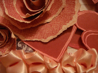
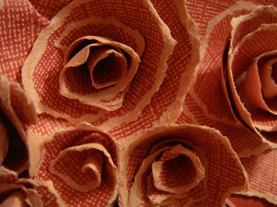
well i decided to do a layout a little different than what i am use to do.....by saying that, i cant believe that i didnt back/matte the photo and i didnt use ANY buttons ...ha ha ha....i still used my pop dots and ribbons.....i like the look of this layout....very clean....i took this pic about 5 1/2 yrs ago right before valentines day....and as a valentines day gift - my husband hand drew the picture for me.....so i guess talent kind runs in our family....ha ha ha.....i love the core color papers...i chose to make the flowers from the paper by simply tearing it in the shape of a circle....easy as pie.....and i backed the hearts with heavy duty card stock and pop dotted some of them.....good old pop dots to the rescue!!!

Saturday, September 12, 2009